
Nowadays having a responsive theme for your website is essential, this is why all our themes are responsive. Our latest one, the Smart, is responsive and even better: it's mobile first! Which means it has been designed to be displayed on all devices from smartphone to computer screen. It's offered in beta test version during the summer for webmasters who want to test it and the final version of the Smart theme will be available to all in September!
So what about the Smart theme?
Smart is a mobile first theme, designed to fit mobile devices first. You can set specific mobile displays on the customization form such as the opening of the navigation menu.
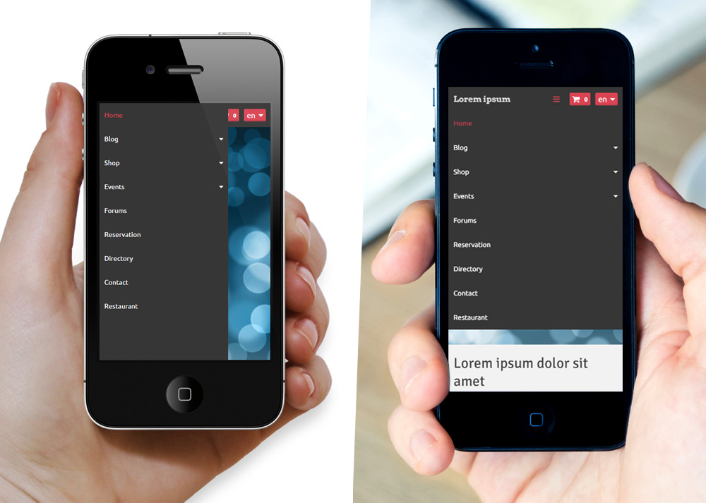
Horizontal opening mode and vertical opening mode
The storePRO offer, also offers the possibility for the user to switch between thumbnail mode display to list mode display:
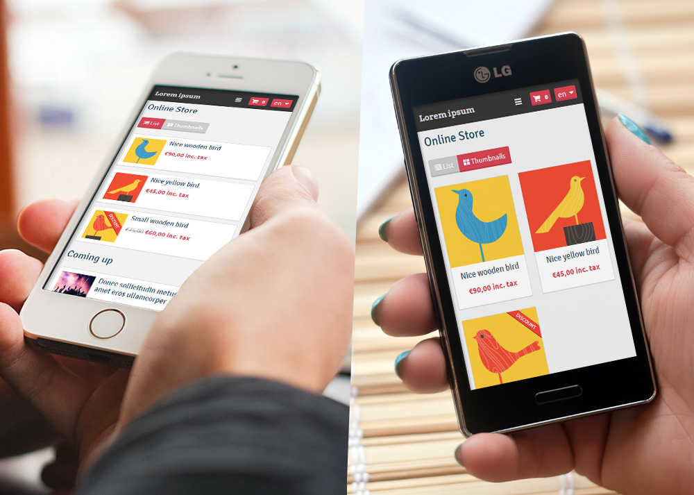
The store's products in list view and thumbnail view
On this customization form you can also define the display and the layout of your vertical menu on mobile devices. If you want one, you can hide it, or put it before or after the content area.
A sought-after place!
Since the screen on mobile device is small, the display of the page may vary according to the screen resolution. The smaller it is, the less the items will be visible.
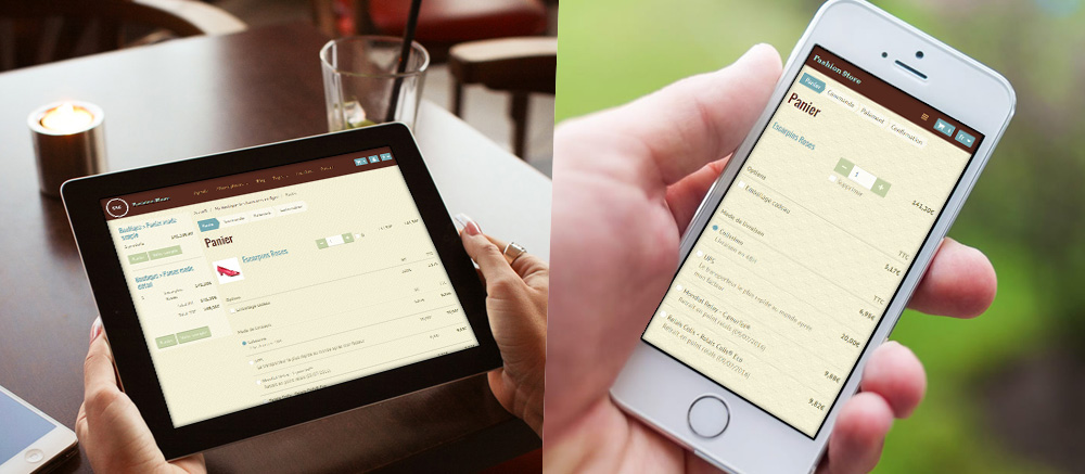
The cart displayed on tablet and mobile
A header with a parallax effect
Feel free to bring a touch of modernity to your website with a parallax effect. It involves the background moving at a slower rate to the foreground, creating a 3D effect (see an example here)
Define the header background picture from the customization form then check the “parallax effect” option to apply it to your site header. To create a page with no header, create a new menu structure in which you uncheck “site header”. Save this version then apply it to your website.
A beta version available
6 versions of the smart theme are currently available for those who wish to test it in beta version. We can adjust the theme in case of dysfunction, also we will be making technical changes until then.
After this testing period (around the beginning of September) we will propose you a final version. Until then, feel free to share all your questions or comments. We will be happy to help you optimize the design and the usability of your mobile first website.
Want to be part of the beta testers and apply the Smart theme to your site? Contact us by email at the following address: betatest@emyspot.com