
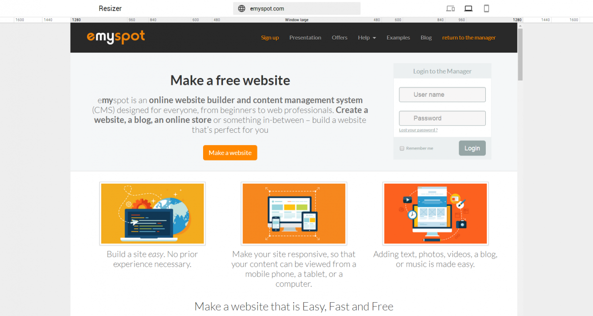
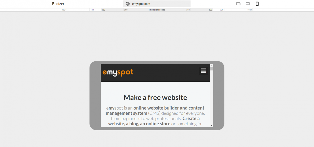
Google has a new tool that helps you visualize your site as seen from multiple screen sizes. From the veiw of a computer, tablet, phone : each version is taken into account with Resizer.
A simple interactive tool
Thanks to Resizer, Google allows everyone to easily see the aspects of their website from different devices. In a glance webmasters can see how their site responds to different screen sizes, all you need to provide is your site's URL address. The advantage of this tool is its interactive interface. You can easily preview your site, and all of its pages at the same time.

The importance of a responsive site
design navigation site perception google visibility
Related posts

Finding and fixing a broken link
The existence of broken links can seriously harm your credibility and may even have a negative impact on your referencing!
Links are called internal or external (or outbound) hyperlinks when we place links directing to text or images on another page of the same site or to a page of another site. But it is not only the links present on your site that are concerned. You must pay attention to backlinks, also called inbound links, i.e. links placed on external sites that direct to your site.
Let's see together how to check whether your site contains dead links and fix them!

Use Pinterest effectively on your website
If you aim to increase your products online visibility and/or bring more visitors to your website, Pinterest could be of great help.
Pinterest is a social media, which is similar to a "visual-based search engine", that can be very helpful for your daily website traffic. Indeed, this social media platform is known to be a great source of referral traffic, which is why we recommend our users to leverage this social "search engine" to promote their services and products to great effect.